“Good design is obvious. Great design is transparent.”
Joe Sparano
Everybody says that experience is the greatest educator. In the future, I want to create businesses. Thus, I decided that I might as well see how much I could learn by challenging myself to create a business in 30-days. If you’ve ever thought about doing this, and hope to live vicariously through me, you can follow my journey here and check my socials where I post regular updates.
Are You a Beginner?
In high school, I did one Canva project, and it was terrible.
I didn’t know how to utilize the app, and though I did my best, my best was not very impressive. After that failure, I labeled both myself and the app – I was a bad designer, and the app was not my forte. That was a mistake. I should not have accepted those labels. I was not a bad designer, and the app was not a lost cause to me, I just hadn’t spent enough time on either. I think it’s a problem that we expect ourselves to be “good” at something right away as if mastery is an innate characteristic bestowed upon an individual at birth. It’s not.
My Canva journey is an example of that. Though I had expected that failed attempt to be my last, it wasn’t. I continued using Canva out of necessity and slowly began to learn the basics of design, as well as how to properly utilize the app. That’s what I want to share today. If I had known a couple of the things I know now, that first attempt probably would not have been so awful. Additionally, I probably would have believed more in my design potential.
If it hadn’t been for necessity, my design journey may have ended that day, and that would have been a shame. Maybe this information will save someone from that. These are the things I wish I had known in that first attempt:
My Tips
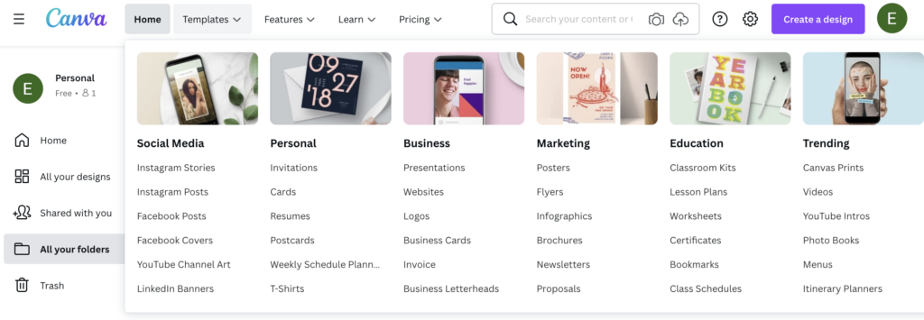
Decide exactly what you’re looking for before you get onto the platform
This may sound counterintuitive to a beginner who was planning to use a pre-built template, but approaching the platform with a sense of purpose will give you the knowledge you need to leverage Canva’s wide variety. If you understand the project you’re working on and get very clear about the design elements that will add to the project’s success, you can filter through a lot of templates. Templates are supposed to serve a purpose. They’re supposed to be used with intention. Most templates are nice, and if your only filter is “do I like it,” you’ll have too many options to work through. Instead, clarify what you want, and why you want it. Designers by definition, make things appealing; good designers use the visual appeal of their designs as leverage to strengthen functionality. It’s simple. The goal is to get to a specific end and look good while doing it.
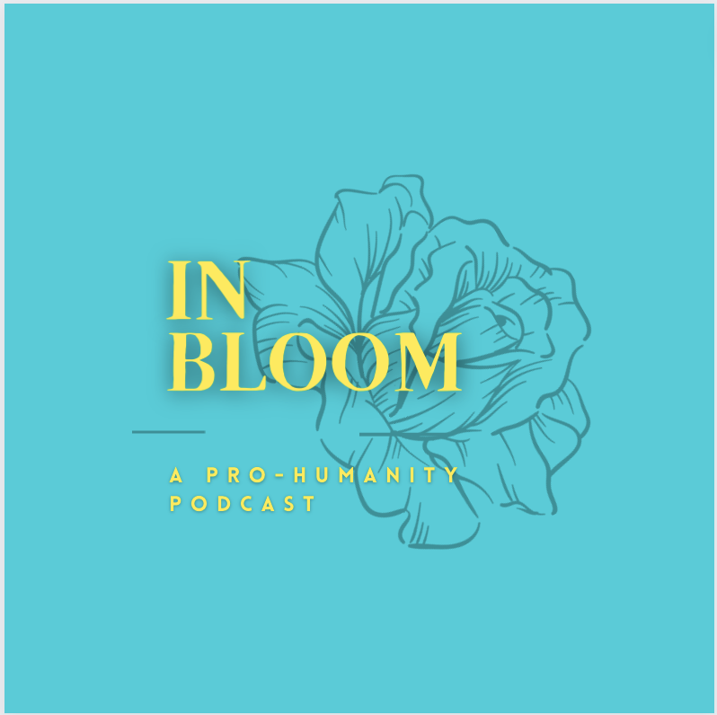
For example, I want to build a post for my podcast’s Instagram. This post is going to highlight great individuals throughout history by showcasing their person and a summary of their accomplishments. If this is my goal, then I need something that has a feature image and title, and something that has space for a short description. As I looked through the templates, I was able to filter and compile easily. My target was clear.


Leverage Templates to Build Your Personal Style
It’s difficult to conceptualize every potential design at the offset, so the best thing to do is to experiment.
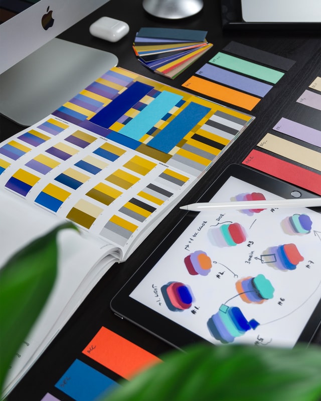
Great designers find their particular style, but only after having experimented with many different styles and methods. One designer may love adding lines, another may prefer a bubbly font. Maybe one prefers to work exclusively with a certain color palette, or a particular hue. Art is unique. It’s a particular expression.
Over time you’ll learn what you do and don’t like. Trust yourself and the process, and in the meantime, leverage templates to expand your conception of what you could create. Pull an element from one template, another from another, change a couple of things, and begin to fashion your unique and interesting designs.
Behance is a good place to find design and portfolios.
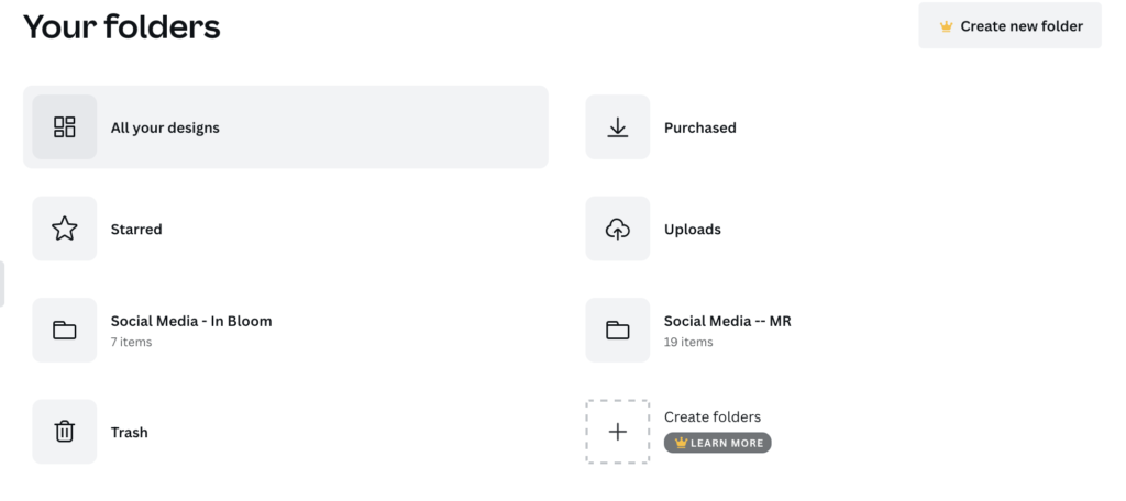
Utilize the Duplicate Feature

Real designers make drafts, add elements, take elements away, change sizes, edit colors and shading, and then, finally after many drafts and changes, decide on a final design. This is the natural evolution of creation. It’s not that creatives can’t decide, or that they don’t know what they like, rather, it’s that they have to test how things will fit together. The only way to do this is to just do it.
Canva knows that this slight elemental change is fundamental to the design process, and they make it easy with their duplicate feature. You can duplicate every design you make by pressing a “plus page” button. Instead of starting over with every new idea or addition, just duplicate the page, try it out, and see how it fits. This allows you to quickly build, test, and strengthen your design intuition.
This was a game-changer. I realized that instead of trying to get everything right the first time, I could experiment until the design resonated. By getting comfortable with iterating, the pressure of creation completely falls off. Instead of trashing anything, I duplicate the same project flow, and experiment. I change colors, fonts, graphics, and copy all at once so I could pay attention to specific variables at a time.


A/B Test Your Creations
Though good designers know what they like, they also take feedback from other people. When it comes to art, most people don’t know why art elicits certain responses, nor can they communicate what those feelings are. Usually, it’s just an instinct. “I like that one better.”
For a designer that is trying to create content, that “better” is enough information. That’s why A/B testing is important. You can utilize your friends, social media, and even random people by placing two design options side by side and tallying up preferences.
That’s the simple strength of A/B testing…you get honest answers. In eliminating the “why,” you eliminate the hardest part of asking others. A/B testing makes it extremely simple to get just enough information to make a better-informed design or product decision.
It’s Like Design Training Wheels
There you go. Now you’re at least somewhat caught up to speed. Canva is a great tool when you know how to utilize it well, and you don’t have to be experienced to utilize it. In fact, Canva is not made for extremely experienced individuals. Canva is like “design training wheels” for those just learning the basics. I would recommend using Canva if you are not a technical designer, and/or if you want to get into technical design because Canva allows you to learn the basics, clarify your likes and dislikes, and experiment with different elements. Remember, it’s a journey. Persist through even the bad designs.
